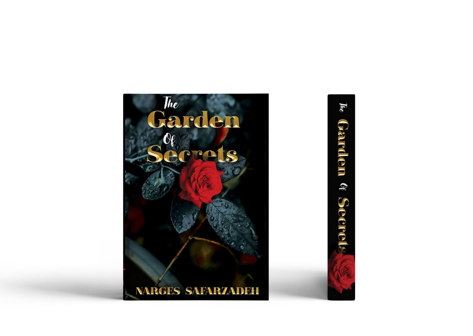
Crafting a Captivating Book Cover : From Concept to Print
Project Overview
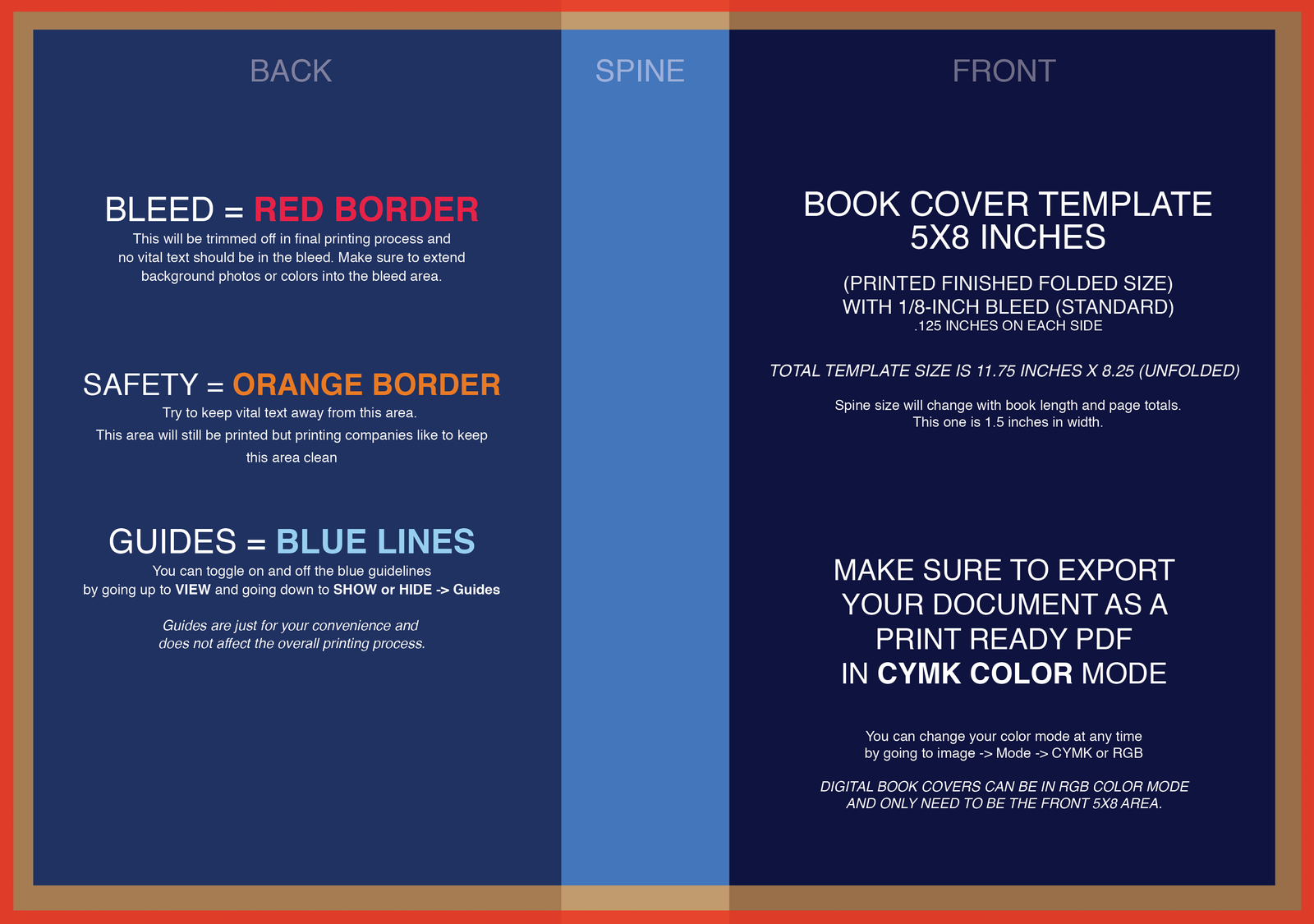
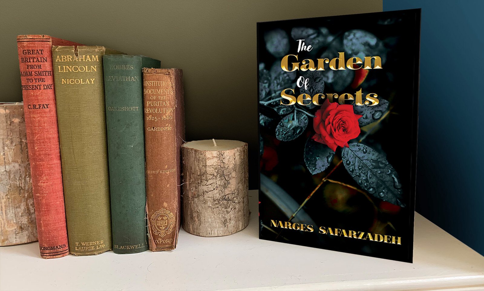
For this project, I created a visually compelling book cover, ensuring a seamless design across the front, spine, and back. The goal was to craft a cover that not only aligns with the book’s theme but also meets industry standards for print production.
Challenges
- Maintaining a high level of detail while ensuring the design remains print-ready.
- Ensuring all elements align properly across the spine and back cover.
- Creating a design that balances text and imagery while maintaining readability.
Process & Solution
- Concept & Layout Design:
- Started with initial sketches and mood boards to define the book’s visual direction.
- Focused on typography, imagery, and composition to create a balanced and engaging cover.
2. Photo Editing & Layering Masks:
- Used Photoshop to refine images, applying non-destructive edits with layer masks for flexibility.
- Adjusted elements like the floral position to create a more cohesive design.
3. Typography & Branding:
- Selected a typeface that complements the book’s genre and theme.
- Positioned the title, author name, and spine text strategically for readability.
4. Print Preparation & Color Management:
- Ensured the design included proper bleed to prevent cutting issues during printing.
- Converted the final artwork from RGB to CMYK while preserving color accuracy.
Outcome
The final book cover design is a visually striking and print-ready product, meeting professional industry standards. Through careful planning and precise editing, the design successfully captures the essence of the book while ensuring a flawless print execution.
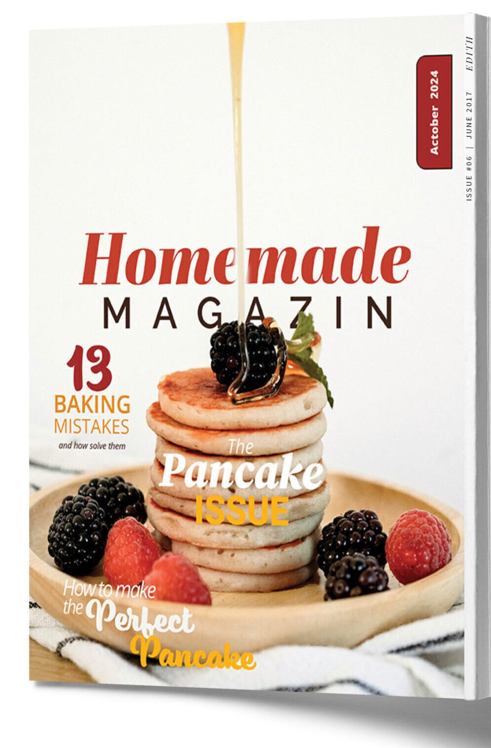
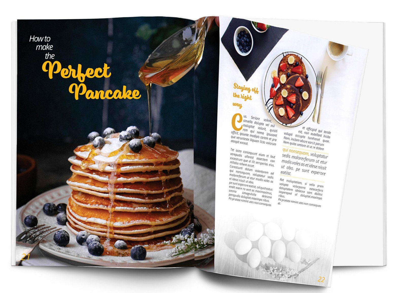
Crafting a Visually Striking Magazine Cover with Typography & Composition
Project Overview
In this project, I designed an editorial magazine cover with a focus on typography, layout, and visual hierarchy to create a visually engaging and professional design. The objective was to craft a compelling cover that effectively guides the reader’s eye, enhances readability, and aligns with editorial design principles.
Challenges & Objectives
1. Capturing Attention – The cover needed to be bold and striking, ensuring it stood out among competitors.
2. Typography Selection & Pairing – Choosing the right typefaces to establish contrast while maintaining brand consistency.
3. Visual Hierarchy & Readability – Structuring elements to create a smooth reading flow, ensuring headlines and key details were easily digestible.
4. Layout & Composition – Designing a balanced layout that allows each element to complement the overall composition.
5. Colour & Contrast – Selecting a color palette that enhances the visual appeal while maintaining legibility over images.
Design Process
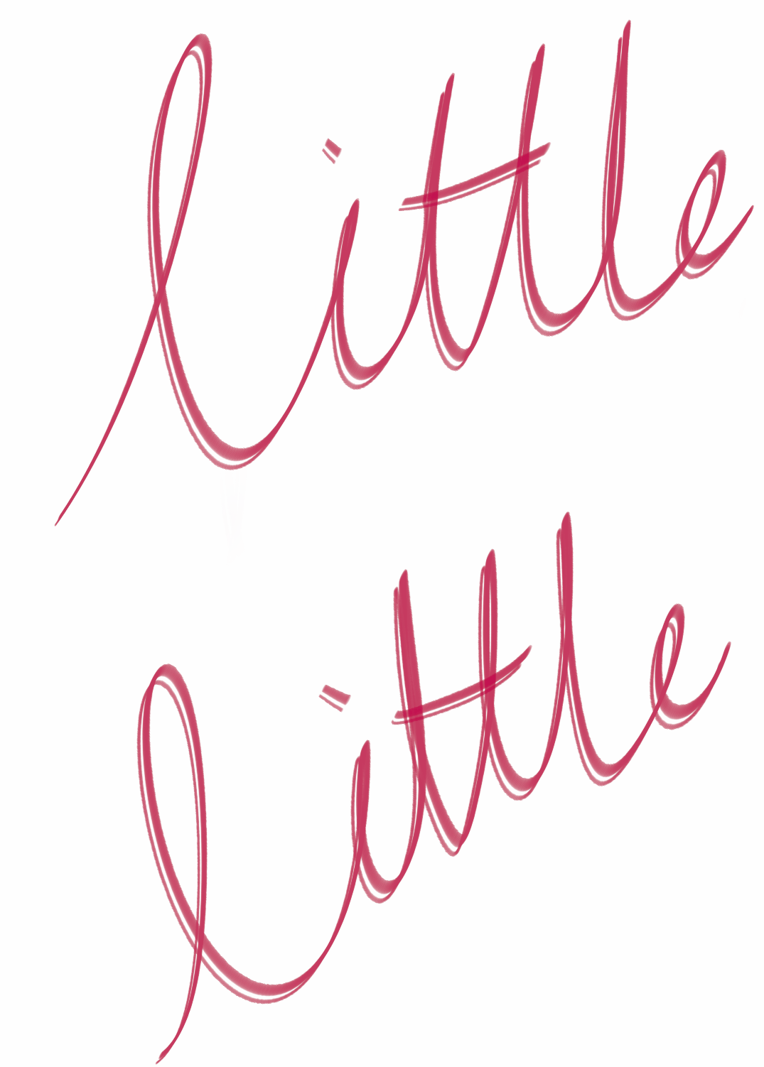
1.Typography & Font Pairing
- Used Abril Fatface for a strong and elegant main headline.
- Paired it with Open Sans for subheadings to create contrast and a modern touch.
- Introduced a high-character script font (Eds Market Bold Script ) for stylistic emphasis.
2.Layout & Structure
- Arranged text in a box-like format for a clean, cohesive appearance.
- Adjusted font weights and sizes to create a focal point and guide the viewer’s eye.
3.Color & Contrast
- Incorporated a gold accent color to highlight key elements and create a premium aesthetic.
- Used drop shadows and natural image contrast instead of excessive effects for a more refined look.
4.Final Touches & Adjustments
- Fine-tuned alignment and margins to maintain a professional, polished look.
- Ensured that eye movement flows naturally, leading from the main title to subheadings and feature stories.
Outcome
✨ A well-structured magazine cover that balances typography, composition, and contrast.
✨ A smooth reading flow that enhances readability and engagement.
✨ A professional editorial design that aligns with industry standards.
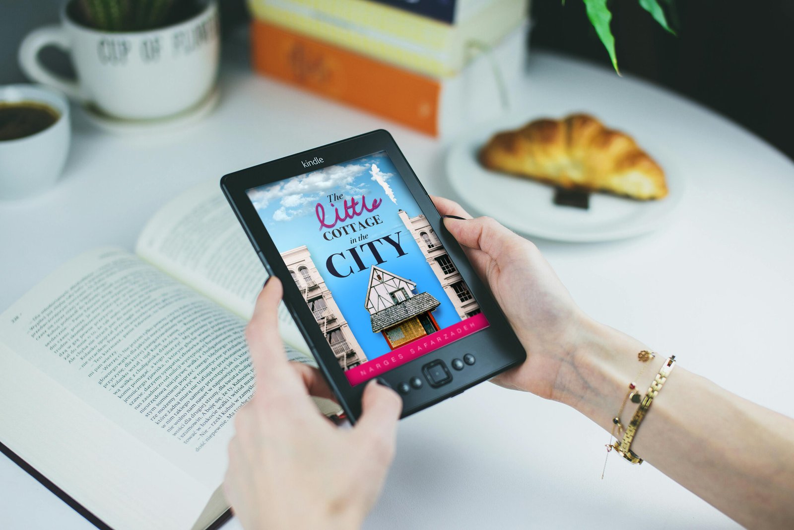
Transforming eBook Covers into Stunning, Realistic Mockups
Project Overview
For this project, I designed a realistic eBook cover mockup to enhance the presentation of a digital book in a professional and marketable way. The goal was to seamlessly integrate the eBook cover onto a Kindle screen while ensuring it looked natural and visually compelling.
Challenges
- Maintaining realistic perspective and alignment on the Kindle screen.
- Ensuring the cover blended naturally with the lighting, shadows, and blur of the original background.
- Adding subtle screen glare and depth to enhance realism.
Process & Solution
- Perspective Adjustment: Used Perspective Warp in Photoshop to align the eBook cover with the Kindle’s screen, ensuring an accurate and natural fit.
- Shadows & Highlights: Created soft shadows along the screen edges to simulate depth and added a subtle glare effect for a realistic matte-finish appearance.
- Blur Matching: Applied Iris Blur to match the natural depth of field in the background, ensuring the cover seamlessly blended into the scene.
- Final Touches: Tweaked opacity, contrast, and blending modes to refine the mockup and achieve a polished, professional look.
Results
The final mockup successfully transformed the flat eBook cover into a lifelike, high-quality presentation, making it ideal for marketing, online promotions, and digital storefronts. By applying advanced Photoshop techniques, I was able to elevate the design beyond a standard flat cover, creating a more engaging and immersive visual.